Bec Goulter | Personal Brand & Website · 2026
"Why is my website beige?"
I'd gone through the trouble of building a custom website with Vercel and Sanity, only to produce something that looked like any premade template. So I started again.
Brand strategy, visual identity, creative direction, website design and AI-assisted development.
The story behind the site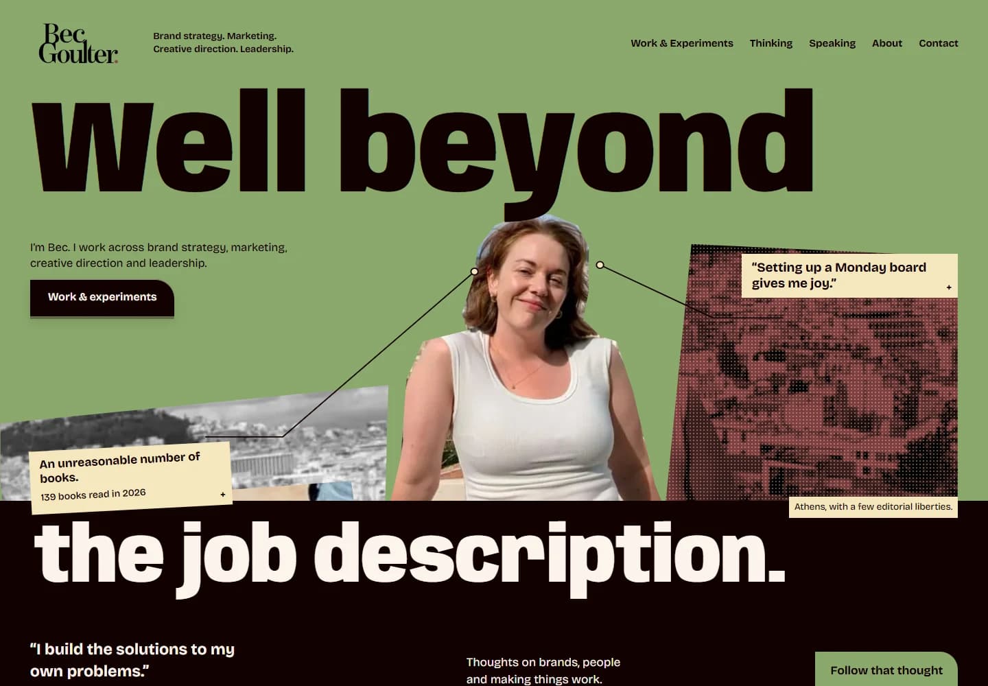
Making myself the client
The idea of having a personal brand has always been anathema to me. I'm not particularly comfortable promoting myself, but I also figured that if I was going to offer brand strategy, creative direction and marketing services, I should be able to demonstrate what I could do.
So I made myself the client.
The difficult part was pinning myself down. I've spent years developing brands for organisations, but applying that same scrutiny to myself meant challenging my own assumptions about who I was and how I wanted to be perceived.
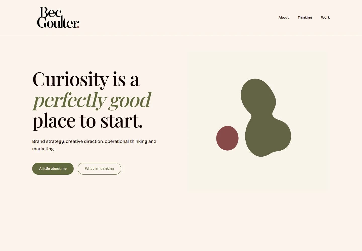
The first iteration was perfectly respectable. It was also incredibly safe.
I'd gone to the trouble of building a custom website with Vercel and Sanity, only to produce something that looked like any premade template on Wix or Squarespace.
I looked around my living room, with its green walls covered in art, and thought: why is my website beige?
I have a perspective, a distinctive voice and a career full of interesting work. I owed it to myself to put that out there rather than squeeze everything into a corporate mould.
I started again.
Finding the creative direction
Curiosity became the foundation of the brand because it's probably the most consistent thing about me. I like understanding how things work, pulling apart problems and occasionally deciding to build something myself because I want to see if I can.
I developed the identity around my love of mid-century design, warm colours and unusual typography. The logo uses customised lettering and an organic, lava-lamp-inspired monogram. It's playful, but considered.

Anybody / Type specimen
Butter · #F4E7BD
Curiosity, always.
Anybody for display. Bricolage Grotesque for the words around it.
For the website, I wanted something closer to an editorial magazine than a corporate portfolio. Huge typography, unexpected compositions, movement and things to discover.
I spent time looking at experimental UI and UX design, particularly the work of Emil Kowalski, and realised how much freedom I actually had. Websites can behave in all sorts of ways, and I wanted to explore that.
The hero deliberately has competing points of interest. It reflects the way my mind works, with different ideas and interests all vying for attention. I wanted visitors to encounter the person first, then uncover the work.
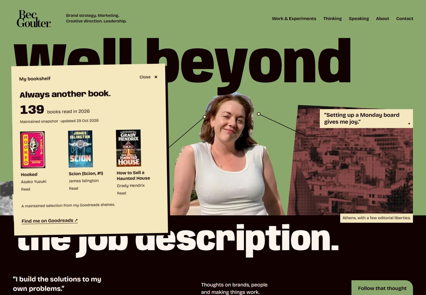
That meant making room for my Goodreads profile alongside interactive demonstrations of projects I'd developed, including a marketing intake automation. I'm artistic and creative, but I'm also systems minded. I wanted both sides represented.
Why not become a coder?
Originally, I'd considered building the website in Wix or Squarespace. I knew I could make something decent with a drag-and-drop builder, but I'd already vibe-coded an app called Two Player and was curious about what else I could learn.
Why not become a coder?
So I downloaded PowerShell.
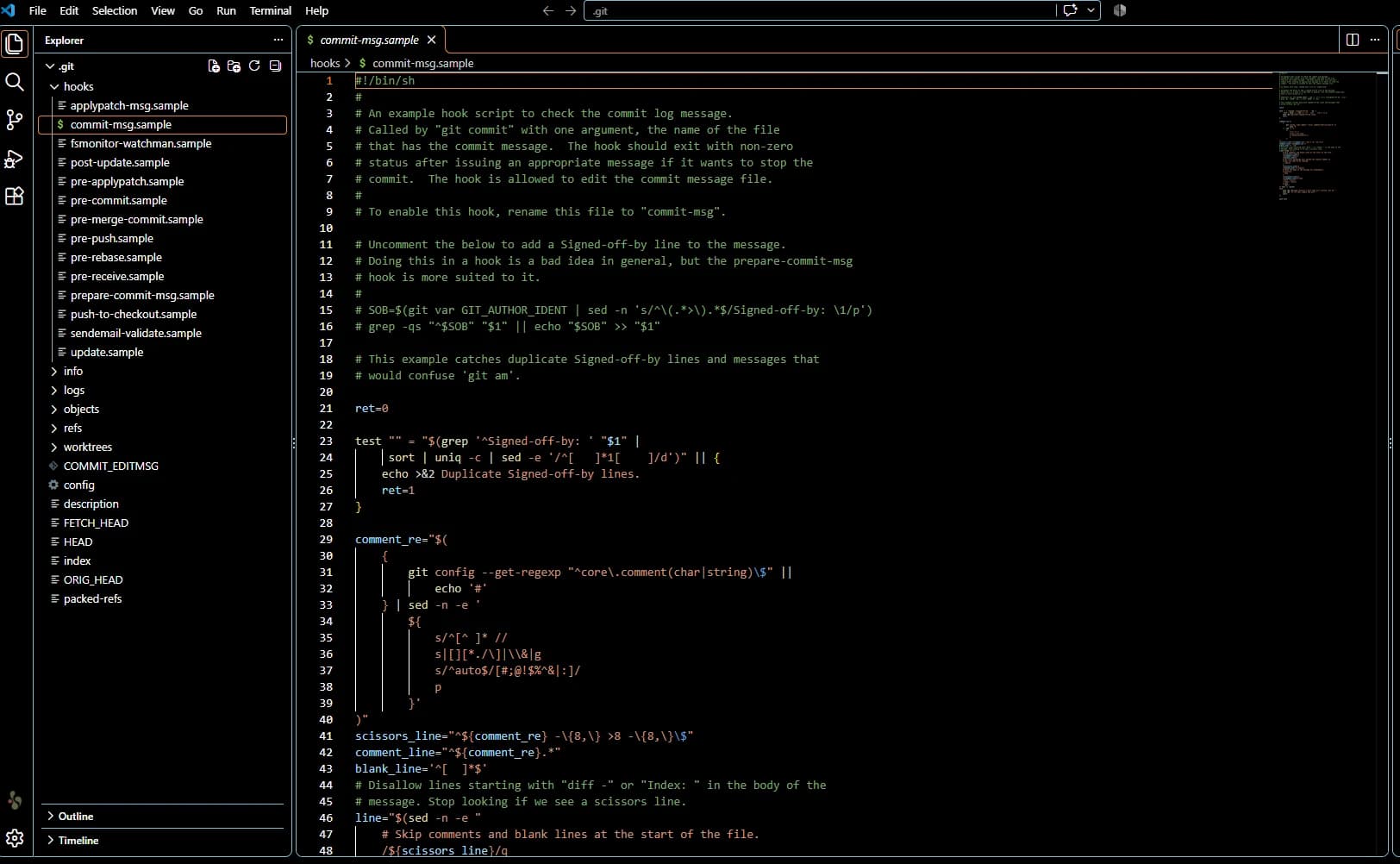
The first time I opened it, I was greeted by lines of different coloured code. I had very little idea what I was looking at, but I was excited. This was something new to figure out.
With AI helping me learn, I began working with Next.js, TypeScript, GitHub, Vercel and Sanity.
My process involved taking my own writing, strategy and design references, working with ChatGPT to develop detailed briefs, and using Codex to implement them. Then I'd review the result, give feedback, troubleshoot problems and move on to the next part of the site.
There was a lot of feedback.
The early output was generic, largely because I hadn't yet understood what I could ask for. As I researched more ambitious design and interaction techniques, I started pushing the work further.
I had to learn what to ask for, how to ask it and when to pull back or edit. Having AI generate code didn't remove the need for creative judgement. If anything, I found myself exercising more of it.
Learning to edit
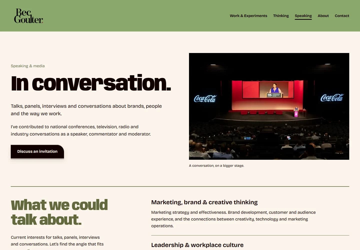
One of the more useful lessons came from the Speaking section. I originally wanted it to be huge and bombastic, covering every appearance, interview and event I'd been involved in.
Then I realised it was far too much.
I stripped it back to a curated selection that demonstrated my experience across on-air appearances, radio, hosting and public speaking.
That became an important part of the design process. I could experiment with almost anything, but I still needed to decide what deserved to stay. The homepage benefited from pushing the design further. The Speaking section benefited from a fairly ruthless edit.
The finished result
I developed the brand from its positioning and visual identity through to a custom website that brings together my work, writing, interests and experiments.
It's a demonstration of what I can do across strategy, design and creative direction, but it's also my own creative space. I'm not trying to launch an agency or turn every visitor into a client. If interesting work comes from it, great. Mostly, I wanted somewhere that felt like me.
Building it also gave me a much better understanding of what's possible with AI-assisted development, provided you know what you're trying to achieve and are willing to put in the work.
I'm not claiming to be a software engineer. I am someone who likes learning new things, stretching beyond what I already know and seeing whether I can make an idea work.
The moment I knew I'd got it right was when I hit Deploy on Vercel.
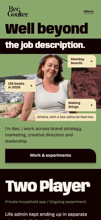
I'd built the thing. And it finally felt like mine.